investing app
Acorns · 2016
Acorns is a finance app that simplifies investing for young people.
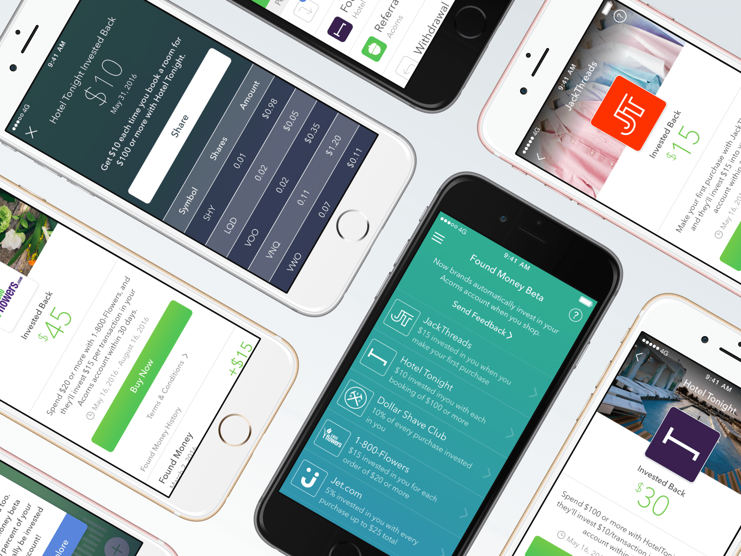
During my time at Acorns, the company was exploring new ways to monetize, which eventually initiated a program called Found Money. Found Money (still in existence today) is a "cash back" platform where users receive direct investments in their Acorns account from merchants they spend with. Airbnb, Lyft, and Nike are all partners on the platform today.
goals and challenges
The first principle we established was that Found Money shouldn’t interfere with the core investing experience of Acorns. We didn't want to become a diluted "deals" app, but something that users found genuine value in.
design process
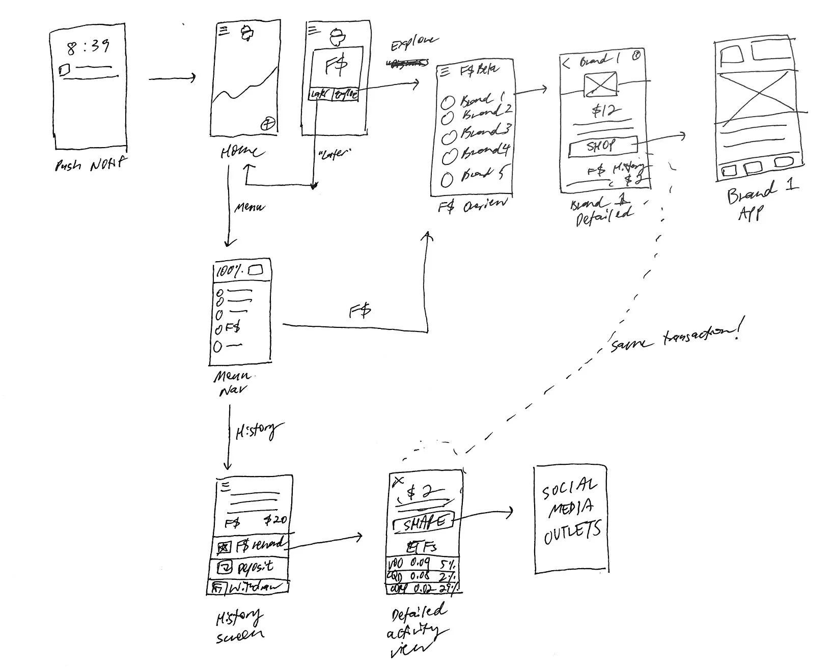
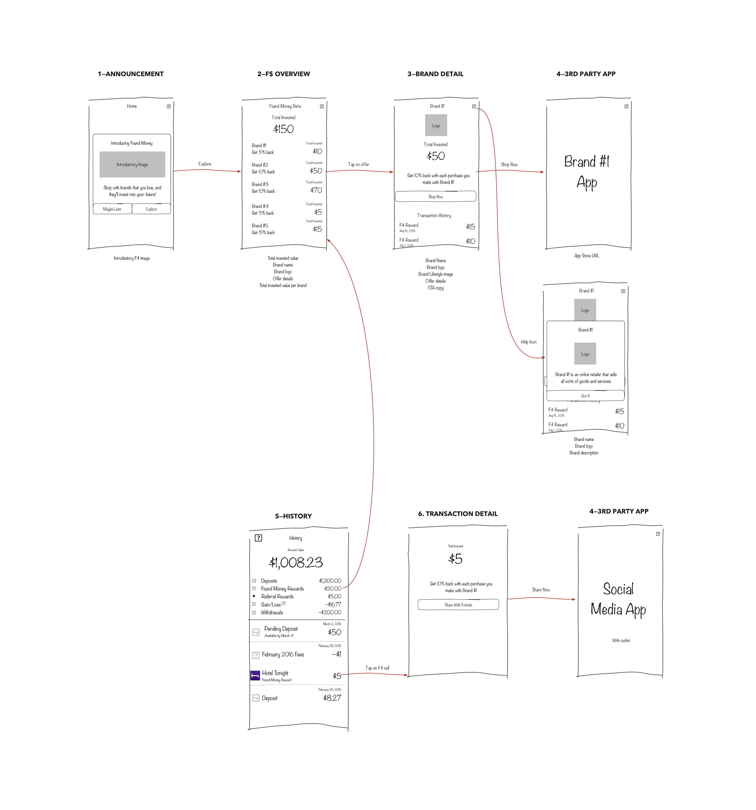
One concept that was particularly interesting that I explored deeply was this card iteration, with a subtle hero image in the background within a physical, skeuomorphic card. The inspiration came from Apple Wallet and Facebook Paper where all the interactions were organic through fluid animation.
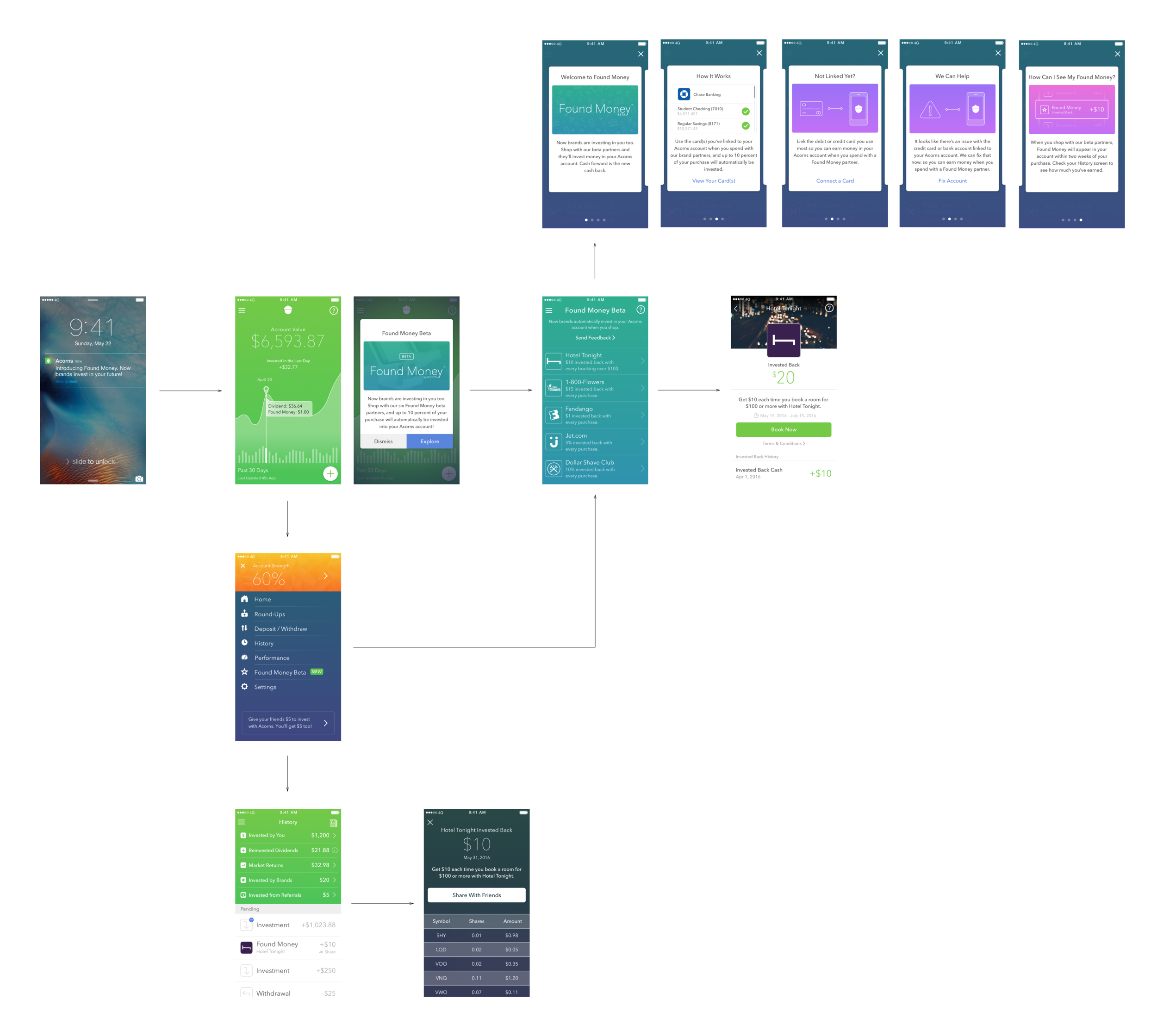
Ultimately, we moved away from this direction — the dark overlay with the image made the text difficult to read. At the time, I pushed for this version but the team ultimately landed on a minimal list view for the MVP.
The brand and transaction detail pages were also important points in the flow because they directly tied in with the goals of converting users to buy and share.
The primary action in the brand detail view is usually to book or purchase something.
Once the user received a Found Money reward, we encouraged users to be more inclined to share their Found Money experience externally on social media.
In all my iterations of the brand detail page, I wanted to emphasize two key points: the branding of the partner, and the details of the offer. I translated the card motif from earlier overview designs onto this details page, but eventually landed on a full screen view.
The total invested by the partner was also an important point as it emphasized how much this brand had invested in a user's account. In earlier versions, we decided to have each user opt in to claim an offer - at the time, the thinking was that this would be a concrete, tangible way to measure user participation. In the end, we transitioned to all Acorns users automatically being opted in to decrease friction and maximize participation, hence the removal of the "Slide to Claim Offer" UI element.